Restaurant menus reflect culinary identity through the fonts, layout, dish descriptions, and prices a restaurant presents to its guests. And each of those choices tells a diner what your kitchen values, long before anyone tastes the food.
Guests even pick up those signals in the first few seconds, which is why treating the menu as a simple price list isn’t ideal. In our Fiore Restaurant kitchen, we read a menu the way we read a recipe, since both reveal the habits and priorities of the person who made them.
To help you build that culinary identity through your menu, this guide covers:
- What fonts and layout reflect your restaurant’s identity
- How templates protect your voice
- How design shapes the meal guests remember
Start by knowing why your menu design is a window into your culinary identity.
Why Is Restaurant Menu Design a Window Into Culinary Identity?
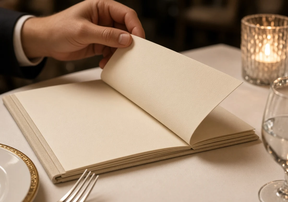
Restaurant menu design works as a window into culinary identity because every design choice signals what the kitchen values. That’s why a menu built around regional Italian cuisine reads nothing like one designed for a kitchen that values speed and volume.
Menu types also carry meaning before a guest reads a word, from a chalkboard to a bound list on heavy card. A handwritten board suggests the kitchen cooks from whatever arrived that morning, while a bound menu promises dishes that will taste the same on your next visit.
Before you reprint your own menu, check the three places that send most of that signal.
What Fonts and Menu Layout Say Before the Food Arrives
Fonts and layout tell guests how the meal will feel. That feeling comes from the type itself, and guests react to it right away. In practice, tight serif type on cream paper tells them to expect a formal meal, while a chalk-style script hints at a counter and a short wait.
The link between type and expectation goes deeper than mood, and it even influences how guests imagine a dish will taste. A 2026 study published in Behavioral Sciences found that bold Song typefaces were associated with bitterness or spiciness, while bold Hei typefaces were associated with saltiness.
Space on the page does similar work (guests slow down when the page does). For instance, dense grids suit fast food menus more than a long dinner, as they push people to decide quickly. That quick decision is exactly what a cramped board is built to produce, so the layout sets the pace of the meal the same way the type sets its mood.
Do Your Dish Descriptions Match Your Cooking?
Often they don’t, and guests catch the gap at the first bite. Strong menu descriptions make a promise the kitchen can keep. But if the page says slow-braised and the kitchen plates osso buco cooked days earlier, the mismatch will cost you trust.
We’ve watched guests ask about homemade pasta versus store-bought the moment the page says which one we roll. Naming the method gives people a reason to pay for the extra hours in the kitchen. Good menu item names do the same work in fewer words, so guests get the story at a glance and the page stays quick to scan.
If your descriptions and your cooking have drifted apart, the fix is usually simple (read every description out loud before it goes to print). Write what your kitchen really does, then cut any word you can’t back up on the line. Once every line on the page matches what leaves the pass, guests trust the menu and order with more confidence.
Menu Items and Pricing as Identity Signals
Menu items and prices signal a restaurant’s identity as clearly as a logo does. Menu length is the first clue, since a short list tells guests the kitchen cooks to order, while a long one promises range.
Pricing style carries weight too, and menu psychology explains why. In practice, a currency symbol reminds guests they are spending money, so rounded numbers without one keep their attention on the dish instead of the cost. That small shift softens the decision, which is why many upscale restaurants print a plain 28 rather than $28.00.
Beyond that, read your menu categories against your cooking (the dessert list gives away more than owners think). Owners call that review menu engineering, and it weighs each dish against what it earns.
Menu Templates Don’t Have to Flatten Your Brand Identity
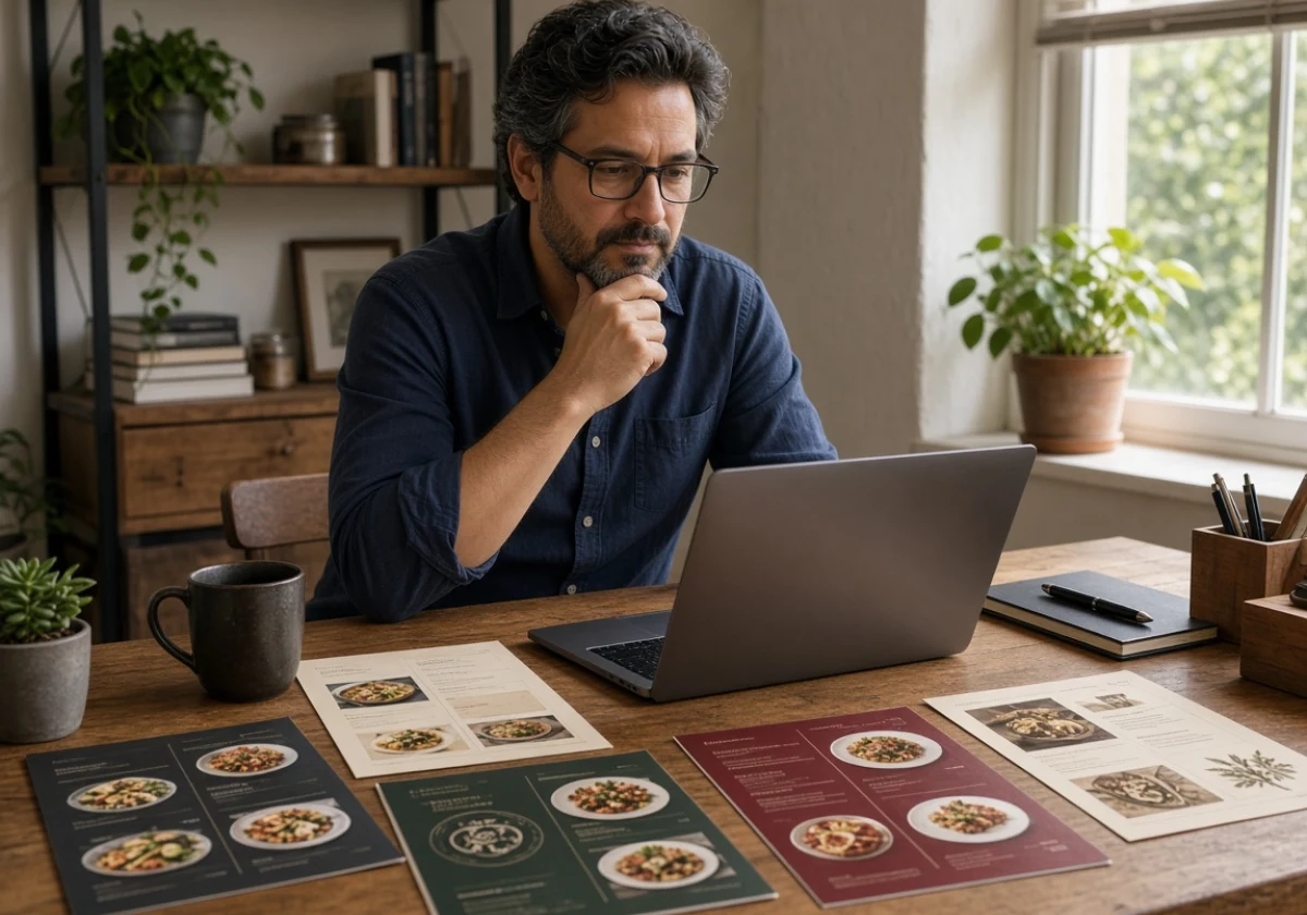
Many owners avoid menu templates because they assume a template will make their menu look like everyone else’s. In practice, a good template only supplies the structure (columns, spacing, and section order), and the personality comes from what you put into it.
That means you don’t need a graphic design background to end up with a menu that feels like yours. Even menu design pros start with the cuisine and build the page around it, and a template just gives you a head start.
When you begin designing from a template, these moves keep your brand on the page.
- Pick a Fitting Template: A tasting menu and a food truck board start from different structures. For example, a paced, course-by-course flow versus a dense one-panel grid. That’s why match the template to how guests eat with you.
- Swap In Your Fonts and Color Schemes: Small changes in type and color schemes carry your brand onto the page. That’s because the palette is already sitting in your logo, so pulling those same colors and typefaces into the template ties the menu back to the brand guests already know.
- Keep the Layout, Change the Voice: Rewrite placeholder text so dish names and descriptions sound like your kitchen. Borrowed copy is what makes templates feel borrowed. You should describe the ingredients, cooking methods and details that make each dish your own.
- Update It as You Grow: Once the season turns, a quick edit keeps the page current. Update your template whenever the kitchen changes its offerings, and check that print menus, digital menus and QR code menus show the same information. Otherwise, guests may order dishes you’ve already removed or question prices that don’t match their bill.
Quick Tip: Save one master file, then export fresh copies for print, your restaurant website, and social media. That single habit builds brand recognition, and guests see the same menu wherever they find you.
Using Menu Design to Create a Stronger Food Experience
Beyond the template itself, thoughtful menu design pays off because guests form opinions about your food before they order a single dish. Your food menu is where those opinions start, since it sets expectations for portion size, price, and how long the meal will run.
Those early judgments also influence where people decide to eat. The National Restaurant Association’s 2025 State of the Restaurant Industry report found that the dining experience is more important than the price of the meal in attracting customers.
For that reason, treat design as part of the customer experience. How you design menu sections influences the order guests eat in, and dining menus that run antipasti, pasta, then mains nudge people toward a full meal. Clear sections further make it easy to find what they came for.
The page should match the room it sits in, because menu design works alongside your restaurant design. A page that clashes with the room dents the brand experience before the food arrives. Plus, naming a grower, a region, or a technique also tells customers why the price sits where it does.
Moreover, cooking with the seasons gives you fresh reasons to rewrite the page. We rework our own menus as the produce changes, and guests who spot new dishes come back to see what’s next.
Now that you know the design principles, let’s see how an Italian restaurant puts them to work.
The Italian Restaurant Test: One Cuisine, Two Very Different Menus
Two kitchens can cook the same regional dishes and still design menus that look nothing alike. The difference comes from the experience each room sells, so a neighborhood trattoria and a white-tablecloth dining room design opposite menus for the same food.
Set the two menus side by side, and the split shows up in four places.
| Menu element | Casual trattoria | Fine dining Italian |
|---|---|---|
| Typography | Hand-drawn, warm | Serif, restrained |
| Dish names | Family recipes, regional dialect | Ingredient-led, minimal |
| Layout | Dense, lively, one page | Open space, tasting flow |
| Pricing style | Rounded, friendly | Clean numerals, no symbols |
Neither column is the better menu, because each one is built for the meal its kitchen serves. What matters is that every element on the page points to the same experience. So decide how your kitchen cooks and serves first, then let the menu follow.
Let Your Menu Tell Your Story
Your menu carries your culinary identity, even if you never designed it with that in mind. Fonts, descriptions, and prices set the mood of the meal, promise how each dish is cooked, and frame what it’s worth.
So pick up your current menu and read it the way a first-time guest would. If the page doesn’t sound like your cooking, you already know what to change first.
Fiore Restaurant shares practical guidance on Italian cooking, seasonal produce, and the dishes that earn a place on a good menu. Talk to the Fiore Restaurant team to swap ideas and get a straight answer about your own.